Skip to content
Version 2Active developmentInfrastructure completeDesktop application under construction
Genesis Design System

Style guide

A living reference for the LynxDock look and feel. Every element below is rendered from the same tokens and components the site ships with - so what you see here is what you get everywhere else.

01
Color Tokens

Color

The graphite base, cyan signal, and status hues. Swatches read straight from the --ld-* CSS variables.

Foundation

Background

--ld-bg

#05090c

Base canvas

Elevated

--ld-bg-elevated

#080d11

Panel

--ld-panel

#0d141a

Panel strong

--ld-panel-strong

#141d25

Lines

Border

--ld-border

rgba(94,242,242,0.14)

Hairline

Border strong

--ld-border-strong

rgba(94,242,242,0.35)

Hover / focus

Text

Text

--ld-text

#cdd9de

Text strong

--ld-text-strong

#ffffff

Muted

--ld-muted

#9fb2ba

Muted 2

--ld-muted-2

#7f939b

Accent

Cyan

--ld-cyan

#35e0e0

Primary signal

Cyan bright

--ld-cyan-bright

#5ef2f2

Blue

--ld-blue

#3b82f6

Blue deep

--ld-blue-deep

#1d4ed8

Status

Warning

--ld-warning

#f5b544

Success

--ld-success

#34d399

Danger

--ld-danger

#f87171

02
Typography

Type scale

A single sans stack with tight tracking on headings, plus the HUD label and monospace treatments.

H1 / 3.5rem

Command your community

H2 / 2.25rem

Structure when you need it

H3 / 1.35rem

Live command tree

Body / 1rem

The communication platform with a tactical operations center - private, lightweight, and yours.

Small / 0.8rem

Supporting caption and metadata text.

HUD labelMission Control
Gradient

Built for People. Not Platforms.

03
Buttons

Buttons

Three variants: primary (glow), secondary (outline), and ghost. Each has a visible focus ring for keyboard users.

04
Glass Panels

Glass panels

Translucent surfaces with a hairline border and blur. Optional hover lift and glow variants.

Default

Static surface for grouping content. Hairline border, subtle inner gradient.

Hover

Adds a border brighten and soft glow on hover. Use for interactive cards.

Glow

Carries a standing shadow-glow for emphasis - reserved for hero and CTA surfaces.

05
Product Cards

Product cards

The ecosystem card: stage label, status dot, name, tagline, summary, and an animated link.

Core Product

LynxDock

The flagship communication app

LynxDock is the flagship: a lightweight communication app for voice, chat, and screen sharing. Start a quick P2P call or run a self-hosted, persistent community - your accounts and data stay with the server you choose.

Explore LynxDock
In Development

LynxDock Studio

The ecosystem IDE

The IDE for the LynxDock ecosystem - an AI-assisted workspace that links docs, sprints, architecture, and research into one navigable knowledge graph.

Explore Studio
In Development

LynxDock Bootstrap

The GSpec compiler

The compiler for the ecosystem - it reads the Genesis Specification and generates the website, docs, and project scaffolding automatically, from a single source of truth.

Explore Bootstrap
06
Feature Cards

Feature cards

Icon tile, title, and a short description - used for principles and product feature grids.

Privacy by default

No surveillance, no data harvesting, no dark patterns. Your accounts and data stay with the server you choose - not ours.

Performance first

Lightweight by design. Fast to launch, light on resources, and calm to use - even on modest hardware.

Self-hosting, made simple

A guided setup wizard generates a real config with sensible defaults - no config files or terminal commands required.

You own your space

Persistent servers with accounts, rooms, history, and admin controls that belong to you and your community.

Built for builders

Developer-grade tooling across the ecosystem - from mission-control dashboards to an AI-assisted knowledge workspace.

One coherent ecosystem

LynxDock, Studio, and Bootstrap share one design language and one philosophy: built for people, not platforms.

07
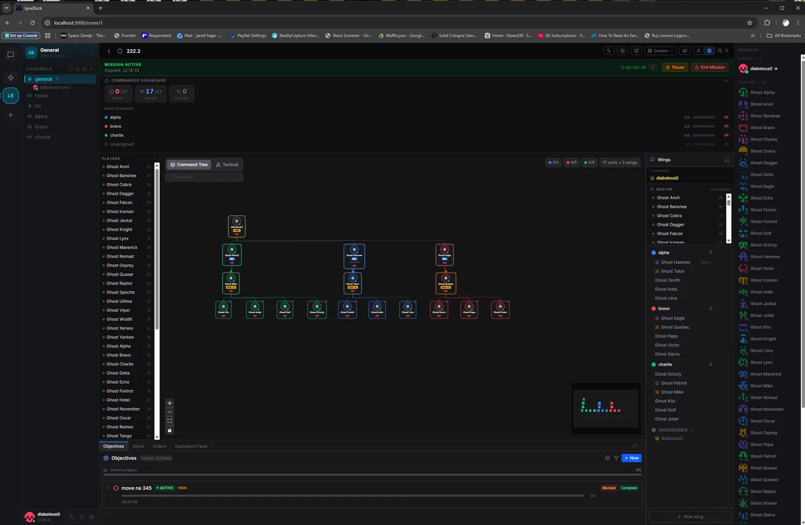
Screenshot Frames

Screenshot frames

Product shots sit in a windowed glass frame with a chrome bar and caption rail.

LynxDock - Mission Control
LynxDock squadron command view with wing readiness and a live command tree
The screenshot frame: window chrome, glass border, and a caption rail.
08
Motion Samples

Motion

Subtle, tactical motion only. Every animation below is disabled automatically under prefers-reduced-motion.

ping-ring
pulse-soft
blink
radar-sweep
Fades up on mountfade-up
09
Accessibility Notes

Accessibility

The rules that keep Genesis usable for everyone, not just visually striking.

  • Contrast. Body text uses --ld-text on --ld-bg and strong text uses --ld-text-strong to clear WCAG AA for normal and large text.
  • Focus. A visible 2px --ld-cyan-bright focus ring is applied globally via :focus-visible; never remove it.
  • Motion. All motion respects prefers-reduced-motion - animations and smooth scrolling collapse to near-instant.
  • Decoration. Purely decorative elements (grid glow, radar sweeps, status dots) are marked aria-hidden so screen readers skip them.
  • Semantics & hit targets. Real headings and landmarks carry structure, and interactive controls stay large enough to tap comfortably.

Full spec: docs/GENESIS-DESIGN-SYSTEM.md. Tokens live in src/styles/tokens.css and src/data/designSystem.ts.